
A quartz sample that looks crisp white in a showroom can read cool grey beside your cabinets, while a dramatic veined slab can feel much busier once it wraps a large island. That is why choosing the best quartz colors for kitchens is less about following a trend and more about seeing how the surface works with the room you actually have.
Quartz gives homeowners a wide range of consistent colours and patterns, from quiet solids to marble-inspired movement. It is also nonporous, which makes everyday quartz countertop cleaning straightforward. The right colour, however, should account for cabinet tone, natural light, kitchen size, backsplash plans, and how much visual activity you want on the countertop.
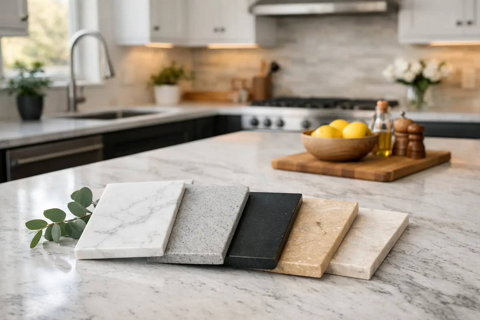
Quick answer: The most versatile quartz colours for kitchens include soft white, warm white, light grey, greige, charcoal, and restrained marble-look designs. The best option depends on your cabinet undertones, lighting, room size, and tolerance for visible dust, spills, and pattern. Always compare larger samples horizontally in your own kitchen before approving a full slab.
| Quartz Colour | Works Well With | Practical Considerations |
|---|---|---|
| Soft white | White, wood, black, navy, and grey cabinets | Bright and flexible, but dark crumbs and spills may be more visible |
| Warm white or cream | Oak, beige, greige, mushroom, and warm white cabinets | Check the undertone carefully to avoid unexpected yellow or pink tones |
| Light grey | White cabinets, medium wood, black fixtures, and simple tile | Offers gentle contrast and is often forgiving between cleanings |
| Greige or taupe | Warm neutral interiors, wood cabinetry, brass, and brushed nickel | Choose a clear, light base in kitchens with limited natural light |
| Charcoal or black | Light cabinets, pale oak, modern kitchens, and feature islands | Dust, streaks, fingerprints, and water spots may be more noticeable |
| Marble-look quartz | Simple cabinets, large islands, waterfall ends, and full-height backsplashes | Vein direction and seam placement should be planned before fabrication |
Soft white remains one of the most practical quartz choices because it works with many cabinet finishes. Unlike a stark, blue-white slab, a warmer white with subtle cream or light grey undertones tends to sit comfortably beside painted white cabinetry, natural oak, black hardware, and stainless steel appliances.
A lightly patterned white quartz is especially useful when you want a bright kitchen without the maintenance concerns of natural marble. Fine grey or taupe veining adds depth while keeping crumbs, fingerprints, and water spots less obvious than they may be on a completely solid, polished white surface.
The trade-off is that white counters can show dark spills, coffee grounds, and colourful food residue more readily. They are easy to wipe down, but a busy family kitchen may benefit from a soft vein or speckle rather than a completely plain white.
Homeowners comparing materials should also consider how quartz performs against natural stone. Our quartz versus quartzite guide explains the differences in maintenance, heat resistance, consistency, and natural variation.
Warm whites, ivories, and gentle cream-based quartz colours suit kitchens with beige, greige, mushroom, or wood cabinets. These shades are also a strong choice when the existing floor tile or backsplash has warm undertones. A cool grey-white countertop against warm finishes can make the room feel slightly disconnected, even when each individual material is attractive.
Look closely at the base colour rather than relying on the slab name. Across a full quartz kitchen countertop, a faint undertone becomes much more noticeable than it is on a small sample. Viewing full slabs under lighting similar to the kitchen helps prevent a white that unexpectedly reads yellow, pink, or grey after installation.
Light grey quartz is a reliable middle ground. It provides more contrast than white but keeps the kitchen open and bright. It works particularly well with white cabinets, medium wood tones, matte black fixtures, and simple backsplash tile.
For homeowners who cook often, a pale to mid-tone grey can be forgiving between cleanings. It generally hides light dust and minor marks better than solid black or bright white. Keep the pattern controlled, though. If the cabinet doors, backsplash, and flooring already carry strong grain or pattern, a quiet grey surface gives the room somewhere to rest.
Greige, taupe, putty, and sandy beige quartz have become popular for a practical reason. They soften a kitchen without locking it into one specific design trend. These colours pair naturally with light wood, warm white cabinets, brushed nickel, brass, and earthy backsplash materials.
They can also be a smart choice for open-concept homes where the kitchen needs to relate to warmer living-area finishes. The key is choosing a quartz with enough clarity in the base colour. A muddier taupe can make a small kitchen look dim, especially if there is limited daylight. In those spaces, choose a lighter warm neutral with fine movement instead of a dark beige solid.
Dark quartz creates a strong focal point, especially on an island. Charcoal, deep graphite, and black surfaces can look excellent with light cabinets, pale oak, or a waterfall island where the veining continues down the sides.
Dark counters do come with a real maintenance consideration. Polished black and very dark solid colours can show dust, streaks, fingerprints, and water spots more quickly than mid-tone colours. This does not make them difficult to maintain, but they reward regular wiping with a clean microfibre cloth.
A charcoal quartz with subtle movement or a honed-looking finish often feels more forgiving than a glossy jet-black surface. Before choosing one, it is helpful to compare how matte and polished countertop finishes behave under your kitchen lighting.
Marble-look quartz is one of the most requested directions for kitchens because it brings character while remaining nonporous. The best option depends on the scale of your kitchen. Fine, delicate veining works well in smaller spaces and alongside detailed cabinetry. Larger, bolder veins make a stronger statement and are often better suited to broad islands or kitchens with simple cabinet fronts.
Pay attention to vein direction during the selection and fabrication process. On a waterfall island, many homeowners prefer the veining to flow from the top down the panel. This requires careful slab layout and can affect how efficiently the material is used.
The same planning matters when a backsplash is cut from the countertop material or when seams are required in a long run. A dramatic pattern should be reviewed across the entire slab, not just through a small sample or online photograph.
The cabinet-countertop relationship usually matters more than any single trend. With white cabinets, you can choose nearly any quartz colour, but the result changes quickly. White-on-white feels bright and continuous, grey provides gentle definition, and black creates a more graphic contrast.
With dark cabinets, lighter quartz prevents the room from becoming too heavy. A white, warm white, or pale grey countertop can reflect available light and separate the cabinet colour from the wall finish.
Medium wood cabinets are highly flexible, although their undertone should guide the selection. Oak with golden warmth often suits creamy whites and greige, while cooler wood stains can work nicely with clean whites and grey-based quartz.
Lighting deserves equal attention. North-facing rooms often receive cooler daylight, which can make grey-veined quartz appear bluer. Warm under-cabinet lighting can shift the appearance of cream and beige materials.
Before finalizing your choice, place larger samples horizontally near the sink, cooktop, and island areas. Look at them during the day and again at night. Countertops are viewed flat, not upright like a cabinet door sample, so changing the sample position can reveal undertones that were not obvious in the showroom.
For a broader decision-making process, review our guide on how to choose kitchen countertops based on appearance, maintenance, durability, budget, and household use.
A countertop colour is only part of the finished result. Countertop thickness, edge profile, seams, cutouts, and surface finish all influence how the quartz presents in the room.
A standard polished edge keeps a light quartz clean and contemporary, while a mitered edge can create the appearance of a thicker, more substantial island. Mitered edges require precise fabrication because the pattern and corners must align cleanly.
The profile should also suit how the kitchen will be used. Simple eased and bevelled profiles are easy to maintain, while more detailed edges can add character to traditional cabinetry. See our comparison of the best countertop edge styles for more practical guidance.
If your kitchen includes a large island, consider whether the island should match the perimeter counters. Matching surfaces create a calm, cohesive look. Using a darker or more veined quartz on the island can add contrast, but it works best when the perimeter is quieter and the island has enough visual space to carry the pattern.
Seams are sometimes necessary on long counters, L-shaped kitchens, and oversized islands. An experienced fabricator plans seam placement around the slab pattern, cabinet layout, sink cutouts, appliance openings, and structural requirements.
A seam will not disappear completely, but thoughtful positioning can make it far less noticeable. Large veining may also make seams more visible if the pattern changes abruptly between pieces. This is another reason to select from a full slab rather than relying only on a small showroom swatch.
Our kitchen countertop seams guide explains when seams are necessary, where they may be placed, and what homeowners should realistically expect.
For an overhang used for seating, colour and pattern should be considered along the exposed edge as well. Large veining may look different near a mitered edge than it does across the main surface of the countertop.
Support requirements depend on the overhang depth, material thickness, cabinet construction, and layout. These details should be reviewed before fabrication rather than after the cabinets are in place.
There is no requirement that the island and perimeter countertops match. The better choice depends on how much contrast the kitchen already has.
Using the same quartz throughout creates a calm and continuous appearance. It can also simplify slab layout, seam planning, and backsplash selection. This approach works well in smaller kitchens or rooms with several competing finishes.
A contrasting island can work well when the surrounding kitchen is relatively simple. For example, a veined white island can be paired with quiet grey perimeter counters, or a charcoal island can be used with warm white countertops around the walls.
Before mixing colours, compare the undertones carefully. Two surfaces can look compatible individually but clash when one has a cool blue-grey base and the other has a yellow or pink undertone.
The safest long-term quartz colours are not necessarily the plainest ones. A soft white, light grey, warm neutral, or restrained marble-look design can remain adaptable as wall paint, hardware, light fixtures, and stools change over time.
Very bold patterns are worthwhile when you genuinely enjoy them and the rest of the kitchen is kept simple enough to support them. Avoid choosing a dramatic quartz only because it photographs well or appears frequently in current design content.
At Stone Valley Countertops, the most useful material consultations start with the whole kitchen: cabinet samples, backsplash ideas, lighting, sink choice, appliance finishes, and island plan. This makes it easier to identify not only a colour that looks good on day one, but one that suits the way the kitchen will be used.
Bring home samples, view full slabs whenever possible, and give yourself permission to rule out a colour that looks beautiful but feels impractical for your household. The best countertop colour is the one that still looks right after breakfast, dinner preparation, and years of daily use.
Cabinet samples, flooring, backsplash ideas, room lighting, and island dimensions can all change how a quartz colour looks. Stone Valley Countertops can help you compare suitable options and review the fabrication details before the material is cut.
Soft white quartz with subtle grey, beige, or taupe veining remains one of the most commonly selected options. It works with a wide range of cabinet finishes and provides more visual interest than a completely solid white countertop.
White and light-coloured quartz can make a kitchen feel brighter and more open because they reflect more available light. The effect is especially noticeable in smaller kitchens, rooms with dark cabinets, and spaces with limited natural daylight.
Light grey, greige, and softly patterned white quartz are often the most forgiving between cleanings. Completely solid black and bright white surfaces may show dust, crumbs, streaks, or water spots sooner.
Dark polished quartz can show fingerprints, dust, streaks, and dried water marks more readily than mid-tone surfaces. A charcoal design with gentle movement or a lower-sheen finish may be more forgiving.
Quartz does not need to match either material exactly. It should coordinate with the undertones of both. In most kitchens, it is easier to choose the countertop and cabinets first, then select a backsplash that connects the two without adding too much competing pattern.
Matching surfaces create a cohesive appearance, while a contrasting island can become a focal point. A contrast usually works best when one surface is quiet and the other carries the stronger colour or pattern.
Yes. Quartz can appear different depending on natural light, artificial lighting, cabinet colour, wall paint, and the size of the installed surface. Larger samples and full-slab viewing provide a more accurate impression than a small showroom sample alone.
Marble-look quartz is well suited to many busy kitchens because it is nonporous and does not require sealing. It should still be protected from excessive heat, harsh chemicals, and direct cutting, just like other engineered quartz surfaces.