
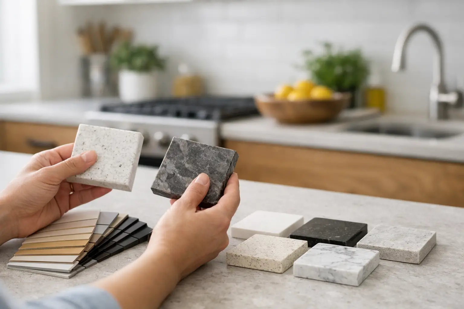
A quartz sample can look soft white in a showroom, then read grey, beige, or unexpectedly bright once it is installed beside your cabinets. That is why learning how to choose quartz colour is less about finding a popular slab and more about seeing how the material behaves in your actual kitchen.
Quartz is consistent, low-maintenance, and available in a wide range of solid colours and natural-looking patterns. Still, a good choice has to work with your lighting, cabinet finish, backsplash plans, and the way your household uses the kitchen. A colour that photographs beautifully may be less practical if it constantly shows crumbs, water marks, or fingerprints.
Quick answer: To choose a quartz colour, start with your cabinets, flooring, and natural light. Compare warm and cool undertones, view larger samples inside the kitchen, and consider how much pattern the room can handle. For many busy kitchens, soft whites, warm neutrals, subtle greys, and lightly patterned quartz are easier to coordinate and more forgiving in everyday use.
Start with the elements that are hardest or most expensive to change. For most kitchen projects, that means cabinetry, flooring, and the overall amount of natural light. Paint can be adjusted later. Countertops usually cannot, so quartz should be chosen with the larger fixed finishes in mind.
Bring cabinet door samples, flooring pieces, backsplash samples, and paint swatches when viewing quartz. Looking at materials one at a time is where many colour decisions go wrong. Even a small cabinet sample beside a quartz sample can reveal a clash between warm and cool tones that was not obvious before.
It also helps to decide what role you want the countertop to play. Quartz can be a quiet background that lets cabinetry take the lead, or it can become the main visual feature of the room. Both approaches work, but trying to make every surface a statement often makes the kitchen feel busy.
White quartz is not simply white. Some whites lean creamy or ivory, while others have cool grey, blue, or crisp bright-white undertones. The same is true of grey, beige, and black surfaces.
A warm white quartz can make cool white cabinets look stark or slightly blue. A cool grey slab beside warm oak may feel disconnected unless another finish ties them together.
Look at the sample in daylight and then under the kitchen’s planned lighting. Hold it next to cabinet doors rather than against a white showroom wall. If you cannot identify the undertone right away, compare it with a pure white sheet of paper. Warmth, greyness, or cream tones become easier to see.
For homeowners choosing between two close options, the better choice is usually the sample that makes the cabinets look more intentional, not the one that appears whitest on its own.
Lighting changes quartz more than many homeowners expect. North-facing rooms often receive cooler, softer natural light, which can make grey veining or cooler tones appear more noticeable. Kitchens with stronger southern or western sunlight can bring out warmth in creamy whites, taupes, and beige veining.
Artificial lighting matters too. Warm bulbs can add a yellow cast to a bright white countertop, while cooler LEDs may emphasize grey veining.
Before finalizing a colour, view a larger sample in the room at different times of day. If the kitchen is still under construction, examine samples near a window and under lighting similar to what will eventually be installed.
This step is especially useful in all-white kitchens. When cabinets, backsplash, and quartz are all light, small differences in undertone become much more noticeable. A slight contrast between the cabinet white and countertop white often looks cleaner than attempting to match both surfaces exactly.
Quartz patterns range from nearly solid colours to broad marble-inspired veining. The right scale depends on the room, slab layout, and other finishes nearby.
A quiet, fine-grain quartz works well when the kitchen already includes movement in wood grain, backsplash tile, or flooring. It can also be practical for smaller countertops, where large veins may be divided into short sections and lose their intended flow.
Large-format veining can make a strong focal point on a wide island, particularly when the island includes a waterfall edge. Dramatic patterns, however, require careful slab planning. Veins may appear differently across perimeter countertops, islands, backsplashes, and waterfall panels.
A fabricator can review where seams, sink cutouts, cooktops, and other openings will fall before fabrication so the finished pattern feels deliberate. You can also read our kitchen countertop seams guide to understand how slab size and layout can affect seam placement.
Do not choose a heavily veined quartz solely from a small sample. Ask to view the full slab or a large slab image where available. A sample can show the colour family, but it cannot show the true width, direction, and concentration of the veining.
Quartz is nonporous and does not require routine sealing, which makes it a practical countertop surface for busy kitchens. Colour can still affect how much day-to-day evidence of cooking is visible.
Very dark solid quartz can show pale crumbs, dust, dried water spots, and fingerprints, particularly in areas with hard water. Very bright white quartz can make coffee drips, sauce, and darker crumbs easy to notice until the surface is wiped.
Neither option is necessarily harder to clean. For everyday care, mild soap, water, and a soft cloth are usually enough. The difference is how visible normal kitchen residue appears between cleanings.
For an active family kitchen, many homeowners find that soft whites with gentle grey or taupe detail, mid-tone greys, and subtle patterns are forgiving choices. They can disguise everyday crumbs better than perfectly solid dark or bright white surfaces without making the kitchen feel overly patterned.
Avoid choosing quartz only because it hides mess. The countertop should still suit the kitchen. The goal is to choose a finish you will be comfortable maintaining while still enjoying how it looks.
With white or painted cabinets, quartz gives you considerable flexibility. A warmer quartz can soften a kitchen with beige, greige, or natural wood accents. Cooler white or grey-veined quartz often works well with cleaner, more contemporary cabinet colours.
If the cabinets are a strong colour, such as navy, green, or charcoal, a quieter countertop usually helps keep the room balanced.
Wood cabinetry deserves extra attention because wood carries a noticeable undertone. Oak may appear golden, red-toned, or neutral depending on the species and finish. Walnut often introduces richer brown and reddish tones.
Pairing warm wood cabinets with a cool quartz can work, but another element such as hardware, backsplash tile, flooring, or wall colour should connect the two surfaces. Otherwise, the countertop and cabinetry may look as though they were selected independently.
Backsplash decisions are usually easier after the countertop has been selected, particularly with veined quartz. A busy countertop paired with a busy backsplash can create too much visual competition.
Many kitchens benefit from a simple backsplash that picks up one colour from the countertop rather than trying to repeat every vein or pattern.
If you are considering using the same quartz vertically, our guide to the pros and cons of a quartz backsplash explains the design, maintenance, fabrication, and cost considerations.
Using the same quartz as a full-height backsplash can create strong visual continuity, but slab size and pattern placement should be considered before fabrication. Depending on the kitchen, the backsplash may also affect how many slabs are required.
Colour is the first thing people notice, but fabrication details have a major effect on the finished countertop.
A 2 cm or 3 cm countertop thickness can make the same quartz colour feel different. A thicker appearance gives an island more visual weight, while a slimmer profile can suit a cleaner, understated kitchen design.
A simple eased edge keeps attention on the quartz colour and pattern and is easy to maintain. More detailed profiles can suit traditional cabinetry, although they may compete visually with heavily veined surfaces.
Our guide to the best countertop edge styles explains how different profiles affect appearance, maintenance, and fabrication.
If you are considering a mitered countertop edge to create a thicker appearance, review the colour and vein direction around the edge return. Precision fabrication makes a noticeable difference in how continuous the pattern appears.
Waterfall islands deserve the same planning. Some homeowners prefer the veining to continue from the horizontal countertop down the side panel, while others are comfortable with the waterfall reading as a separate visual plane.
Neither approach is automatically better. The right decision depends on the quartz pattern, available slab yield, fabrication requirements, budget, and how important vein continuity is to the design.
The final decision should not be made from a small chip under showroom lighting. Take home a larger sample whenever possible and place it horizontally, the same way the countertop will sit.
Stand back from the sample, then look at it closely beside cabinets, flooring, and backsplash materials. Check it in morning daylight, afternoon light, and under the kitchen’s artificial lighting.
Pay attention to finish as well as colour. Most quartz is polished, but matte, honed, or suede-style finishes may be available in certain collections. Matte finishes can soften bold colours and reduce glare, although fingerprints and oils may appear differently than they do on polished surfaces.
If you are comparing finishes, our guide to matte versus polished countertops explains how each option behaves in everyday kitchens.
Once you have narrowed the selection to one or two colours, review the complete project rather than looking at colour alone. Before ordering or templating, consider:
At Stone Valley Countertops, material selection and fabrication planning are considered together. Reviewing the slab and project layout helps identify practical details such as sink placement, seam locations, overhangs, edge profiles, and how the quartz pattern will appear after fabrication.
A good quartz colour should still feel right after the cabinet hardware changes, the stools move in, and the kitchen is being used on a busy weekday. Give yourself time to see the material in real light, beside the finishes that will remain, and choose the option that feels settled rather than simply striking for a few minutes in a showroom.
Quartz with subtle movement, soft veining, or a light speckled pattern tends to disguise crumbs, fingerprints, and minor water marks better than completely solid black or bright white surfaces. Maintenance is still straightforward, but the pattern makes everyday residue less noticeable.
No. An exact match is usually unnecessary and can be difficult because cabinet paint, quartz, and lighting all affect colour differently. A slight contrast often looks more intentional. The important part is making sure the undertones work together.
In most kitchens, choose the countertop first. Quartz has fewer practical substitutes once fabrication begins, while backsplash tile is available in many colours, shapes, and finishes. Selecting the countertop first usually makes backsplash coordination easier.
Yes. White quartz is nonporous and easy to maintain when cleaned properly. Very bright or solid white surfaces can make crumbs and spills more visible, so a soft white with subtle veining can be more forgiving for households that use the kitchen heavily.
Yes. The slab itself has not changed, but lighting, surrounding cabinetry, flooring, wall colour, and the size of the installed surface can make quartz appear warmer, cooler, lighter, or more patterned than it did in a showroom sample.
It is especially useful for quartz with large veins, dramatic movement, or significant pattern variation. A small sample is usually enough to evaluate the base colour and undertone, but a full slab or large slab image gives you a much better idea of how the pattern will look across an island or long countertop run.
If you are narrowing down quartz options, bring cabinet, flooring, or backsplash samples when you visit Stone Valley Countertops. Seeing the materials together makes it easier to compare undertones, patterns, thicknesses, edge profiles, and slab layouts before fabrication begins.
Contact Stone Valley Countertops to discuss your kitchen project or visit one of our Ontario showrooms to compare quartz options in person.