
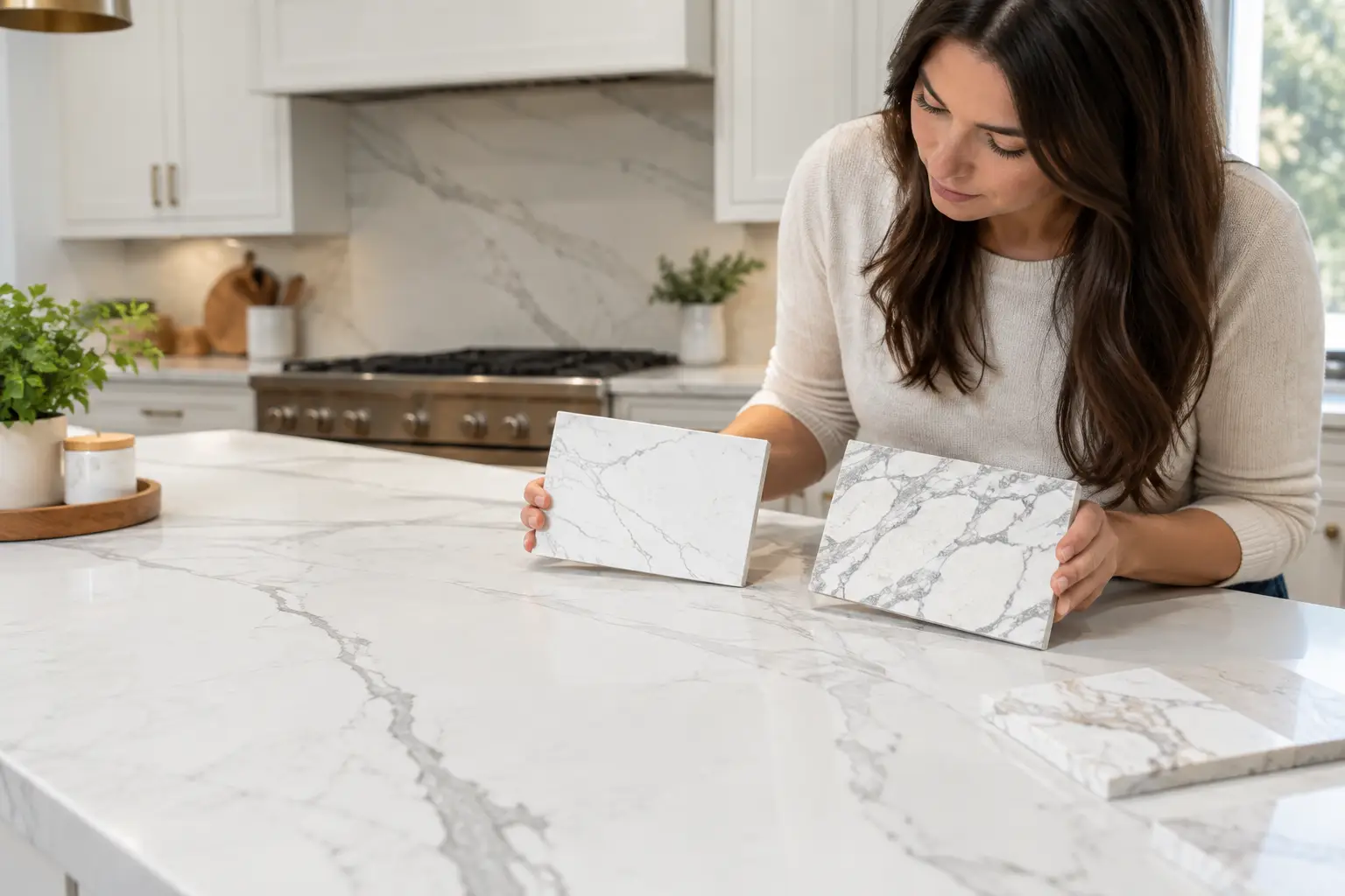
A dramatic vein can make a countertop the defining feature of a kitchen, but it can also feel disconnected if every surrounding finish competes for attention. Knowing how to match countertop veining comes down to more than choosing a white slab with grey lines. You need to consider the movement in the material, cabinet colour, undertones, seam locations, and how the pattern will continue across an island, backsplash, or waterfall edge.
The goal is not to make every element match perfectly. It is to create a kitchen where the countertop looks intentional from every angle, including the views you see most often when cooking, sitting at the island, or walking into the room.
Start by identifying the dominant and secondary colours in the countertop veins, then compare those undertones with your cabinets, flooring, backsplash, and hardware. For strongly veined slabs, keep surrounding finishes quieter and review the full slab before fabrication. Vein direction, seams, sink cutouts, waterfall panels, and backsplash placement should also be planned before the stone is cut.
Countertop veining ranges from subtle, soft movement to bold, high-contrast lines. Before selecting cabinet colours, hardware, or a backsplash, decide how much visual attention you want the surface to receive.
A quiet quartz with fine grey veining can work comfortably with painted cabinets, textured tile, and warmer wood accents. A heavily veined marble-look quartz, quartzite, marble, or porcelain usually needs more visual space around it. When the countertop has large sweeping veins, simpler cabinets and a restrained backsplash often produce a cleaner result.
Look at both the colour and the pattern. Grey veining can lean cool blue, charcoal, taupe, or warm brown. Gold or rust veining often works naturally with warm whites, wood tones, brass, and softer black accents. A slab can look mostly white under showroom lighting but reveal beige, green, grey, or blue undertones once it is placed beside your cabinet sample.
This is especially important with natural stone. Granite, marble, and quartzite vary from slab to slab, so a small sample may not show the full range of movement. Whenever possible, make final design decisions from the actual slab selected for your project rather than from a small chip.
Cabinets form the largest block of colour beneath the counter, so they have a major influence on how countertop veining reads. A useful starting point is to pull one of the secondary tones from the slab rather than trying to match its brightest background colour exactly.
For example, a countertop with warm grey and light taupe veins can look balanced with mushroom, greige, natural oak, or warm-white cabinets. A surface with crisp charcoal or blue-grey movement can work with clean white, light grey, navy, or black cabinetry. The exact combination depends on how much contrast you want.
White cabinetry gives you considerable flexibility because the countertop can either blend quietly or become the focal point. If you choose a bold slab against white cabinets, consider keeping the backsplash and other large surfaces more restrained so the kitchen does not have several competing patterns.
Be careful with different whites. A creamy slab beside a very cool cabinet white can make the countertop appear yellow, while a cool white slab beside warm cabinetry can suddenly look blue or grey.
Wood cabinets deserve a closer look. Warm oak, walnut, and maple can clash with a countertop that has distinctly cool grey veining, but they can work beautifully when the slab contains warmth in its background or secondary veins.
Place a cabinet door sample directly on the slab and view the combination in daylight as well as under the lighting planned for the kitchen. Undertones are often much easier to see this way than on a computer screen or from separate samples.
Practical tip: Take your cabinet door, flooring sample, backsplash sample, and hardware finish with you when viewing slabs. Looking at the materials together is much more useful than trying to remember a colour from home.
A backsplash should support the countertop rather than turn the wall into a second focal point. This is where many otherwise good material selections become too busy.
If your counter has pronounced movement, a full-height slab backsplash can be one of the most cohesive choices. Using the same material allows the pattern to continue vertically and reduces the visual interruption created by grout lines.
The layout matters. A fabricator can plan whether veins align across the countertop and backsplash, continue in a directional flow, or are positioned to create a bookmatched effect. Bookmatching mirrors adjoining pieces so the veining opens outward from a joint. It can be particularly effective behind a cooktop or on a feature wall, but it requires careful slab planning and can affect material yield.
If you prefer tile, consider a quieter option when the countertop has strong movement. A simple white, cream, or lightly textured tile usually lets the countertop remain the feature. Conversely, a countertop with minimal veining can handle more backsplash texture or pattern.
Veins are not just decorative. Their direction changes how long, wide, and connected a countertop appears.
On a long perimeter run, movement following the length of the counter can emphasize the kitchen’s horizontal lines. On an island, veins can run lengthwise to make the island feel more expansive or across the width to direct attention toward seating or an adjacent range wall.
Neither direction is automatically correct. The better choice depends on the room’s sightlines, the slab’s pattern, available material, cutouts, and the areas of the countertop that will be most visible.
This conversation should happen during slab layout, before fabrication begins. At this stage, the countertop pieces are mapped onto the slab while accounting for sink cutouts, cooktop openings, overhangs, edges, seams, and usable slab area.
A large vein may be centred on an island, moved away from a sink cutout, or carried toward a waterfall panel. Planning these details before cutting provides much more control over the finished appearance.
A waterfall island deserves particular attention because the countertop turns vertically from the island top toward the floor. With directional materials, the way those two pieces meet becomes one of the most noticeable details in the kitchen.
The stone can sometimes be laid out so a prominent vein appears to continue from the horizontal countertop into the vertical waterfall panel. Whether this is possible depends on slab dimensions, island size, pattern direction, the number of waterfall ends, and available material.
Continuous vein matching can also require additional slab material because the fabricator may need to position pieces for appearance rather than maximum material yield. That is why vein matching should be discussed before the slab is cut rather than during installation.
If you are considering this detail, our guide to waterfall island project details explains how mitred corners, seams, supports, and slab layout affect the finished result.
Most large kitchens require seams, particularly with long runs, L-shaped layouts, oversized islands, or projects where slab dimensions limit the size of individual pieces.
The goal should not be to promise an invisible seam. A well-made seam is narrow, carefully positioned, colour-matched where practical, and less noticeable when it does not unnecessarily interrupt the strongest part of the pattern.
When matching veining, ask where seams are likely to fall and how adjoining pieces will be oriented. With a linear vein pattern, the fabricator may be able to continue some of the movement across the seam. With busier natural stone, the seam may blend into the existing variation.
Practical requirements still come first. Seams may be required near corners, because of slab dimensions, or because a piece must be transported and safely carried into the home. A good slab layout balances visual flow with the realities of fabrication and installation.
For more detail, see our guide to kitchen countertop seams.
An eased edge is an understated option that works with almost any veined surface. It keeps attention on the slab itself and suits both subtle and strongly patterned materials.
A mitred edge can create the appearance of a thicker countertop, which can work particularly well on large islands and waterfall designs. The mitre also introduces another pattern transition, so strongly veined materials should be laid out with that corner in mind.
Thicker-looking edges can make dramatic stone feel more substantial, while a standard profile often suits a cleaner, quieter kitchen. Strong veining generally benefits from enough uninterrupted surface area to read as a complete pattern rather than a collection of small fragments.
Many homeowners choose a veined surface because they like the appearance of marble but want different maintenance characteristics. The material itself should still suit the way the kitchen will be used.
Quartz countertops offer a broad selection of veined patterns and do not require sealing. Because the pattern is manufactured, homeowners should review the full slab or slab image where possible, especially with large-scale designs where pattern repeats and transitions can affect seams and waterfall panels.
Quartzite provides natural movement and variation that can be difficult to reproduce in manufactured materials. Each slab is different, making actual slab selection particularly important. Depending on the stone, periodic sealing may also be required.
Marble offers distinctive natural veining, but its appearance comes with different maintenance expectations. Acidic foods and cleaners can etch marble, so homeowners should understand how the surface will change with use before selecting it for an active kitchen.
Porcelain and sintered stone can provide dramatic printed veining, large-format surfaces, and clean contemporary profiles. These materials are particularly useful for countertops, full-height backsplashes, and waterfall applications, but fabrication and pattern placement need to be carefully coordinated.
Before final approval, review the cabinet samples, backsplash, flooring adjacent to the kitchen, and selected countertop material together.
Then consider the kitchen from its main sightlines. Look at the island from the entry, the range wall, the sink area, and any transition between the countertop and waterfall panels.
For natural stone and strongly patterned engineered surfaces, ask to review the proposed slab layout when appropriate so you understand where important veins, seams, cutouts, and waterfall transitions are likely to land.
If you are selecting natural stone, our guide on how to compare stone slabs explains why colour variation, movement, usable slab area, and layout possibilities should be considered before fabrication.
At Stone Valley Countertops, this planning stage is where precise templating and fabrication make a visible difference. The slab’s character has to work with the practical requirements of the kitchen, including cutouts, seams, cabinet dimensions, overhangs, access, and installation.
Give the slab room to be itself. When countertop veining, cabinet colour, backsplash, sightlines, and fabrication layout are considered together, the finished surface feels coordinated without looking overly matched.
Not exactly. It is usually better to coordinate the undertones than to search for an exact colour match. A secondary grey, beige, taupe, brown, or gold tone in the countertop can help connect the slab with the cabinetry without making the kitchen look overly coordinated.
They often do because lengthwise movement can emphasize the size of an island, but it is not a rule. The best direction depends on the slab pattern, island dimensions, sink or cooktop placement, waterfall panels, and the main sightlines through the kitchen.
Sometimes. A fabricator may be able to position adjoining pieces so the movement flows naturally across a seam, but an exact match is not always possible. Natural stone does not repeat, while engineered surfaces may have pattern limitations or repeats that affect the layout.
Often, yes. The horizontal countertop and vertical waterfall panel can sometimes be positioned so the pattern appears to continue around the mitred corner. The result depends on slab dimensions, vein direction, island size, and available material, so it should be planned before fabrication.
It does not need to match every vein. With a strongly veined countertop, a quieter backsplash usually creates better balance. Another option is a full-height backsplash made from the same countertop material, where the slab layout can be planned as part of the overall pattern.
For a relatively uniform engineered surface, a sample can provide useful colour information. For granite, marble, quartzite, and strongly patterned manufactured slabs, viewing the actual slab or a full-slab image is much more useful because a small sample cannot show the complete movement and variation.